Choosing paint colours can feel exciting at first. That is, until doubt starts to creep in. With so many options available, it’s easy to make a choice that looks great as a small sample, but doesn’t quite work once it’s on your walls. At Moorcroft Interior Design, we often see the same paint mistakes made again and again. The good news? They’re easy to avoid with the right guidance, which can be achieved with a paint consultation by an interior designer.
Here are five of the most common paint colour mistakes and how to steer clear of them.
1. Choosing a Colour Without Considering the Light
Light changes everything. A colour that looks warm and soft in a bright, north-facing room can feel flat or cold in a darker space. Natural and artificial lighting, the time of day, and even the season all affect how paint appears.
An interior designer looks at how light moves through your home and selects colours that work beautifully in those conditions, so there are no surprises once the paint goes on.
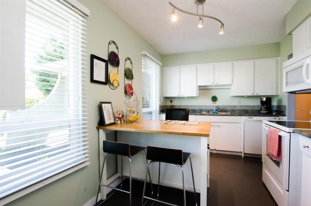
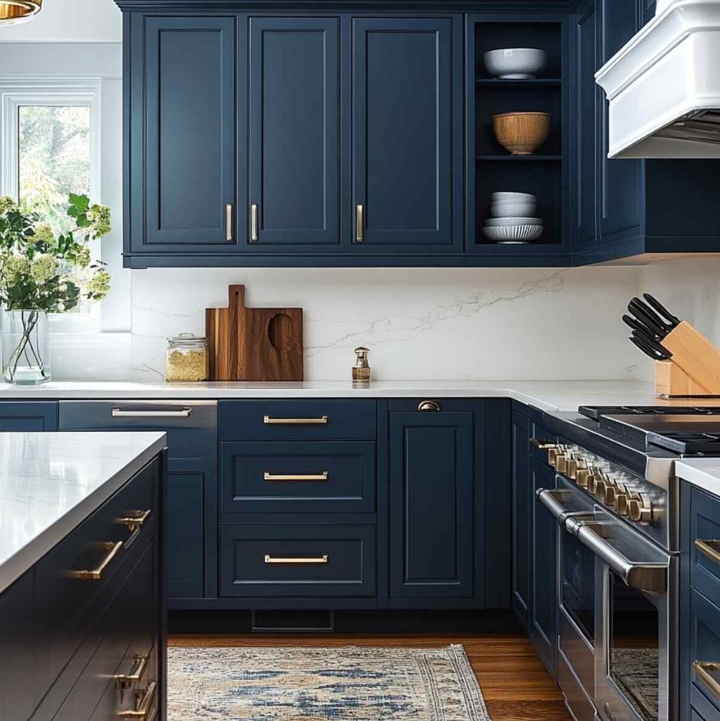
This client loved a sage green swatch in the south facing paint store, but once this was up on the walls the colour appeared darker in the north facing room, making the kitchen appear smaller, squat and busy.
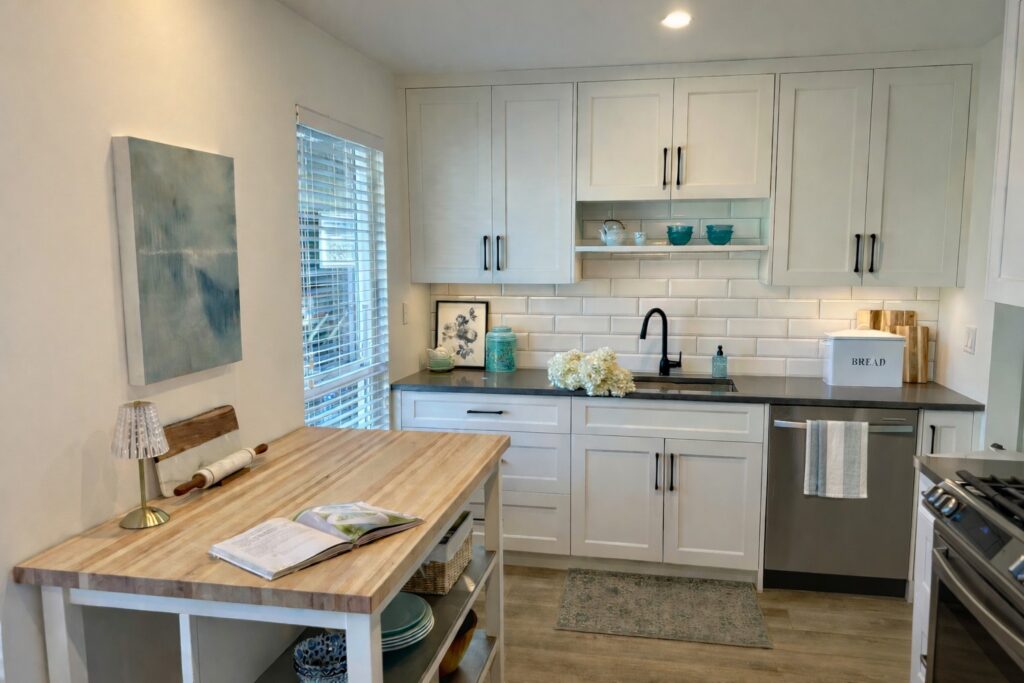
To fix this issue we chose the Cloud White OC-130 from Benjamin Moore, as it had warmer cream tone in the space, which helped the space feel brighter, bigger and taller. The green was still incorporated by accessories and art, giving the space the perfect pop of colour, while still feeling open and airy.
BEFORE KITCHEN
AFTER KITCHEN
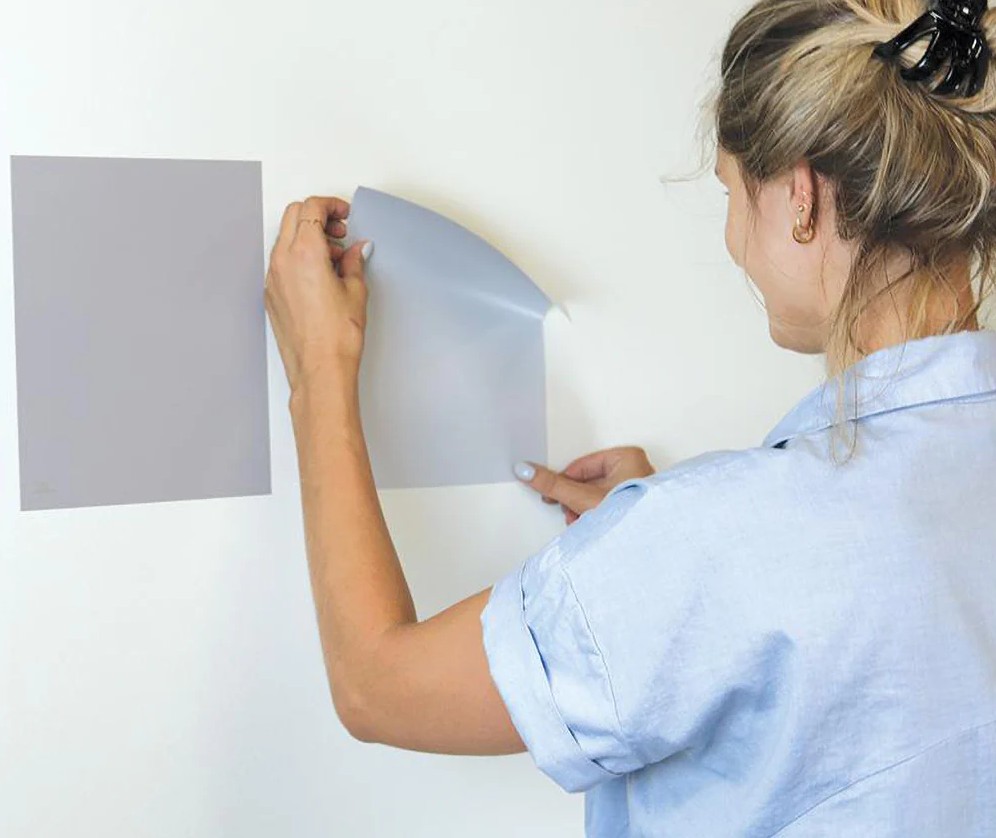
2. Relying on Small Swatches
That tiny paint card can be misleading. Colours often appear lighter, darker, warmer, or cooler once they cover an entire wall. Many homeowners commit too early without seeing the colour properly in their space.
We always recommend testing colours thoughtfully and understanding how they’ll behave on a larger scale before making a final decision. Colour consultants have large samples and can even place complimentary orders for larger peel and stick samples.
3. Forgetting About Existing Finishes
Paint doesn’t exist in isolation. Flooring, cabinetry, tiles, furniture, and even artwork all influence how a colour reads. Ignoring these elements can result in a colour that clashes or feels out of place.
At Moorcroft Interior Design, we consider everything already in your home to ensure your paint colours complement, rather than compete with, whats already there.
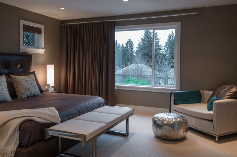
For this home we wanted a dramatic and moody bedroom that is perfect for winding down after a long day. The cozy wool carpet and light beige textiles contrasts beautifully darker walls in Poised Taupe 232 by Sherwim Williams, which creates a striking contrast.
4. Treating Each Room Separately
Choosing colours room by room often leads to a home that feels disjointed. Even beautiful colours can feel wrong if there’s no flow from space to space.
Instead, we create a cohesive palette that connects rooms effortlessly, giving your home a calm, considered feel throughout.
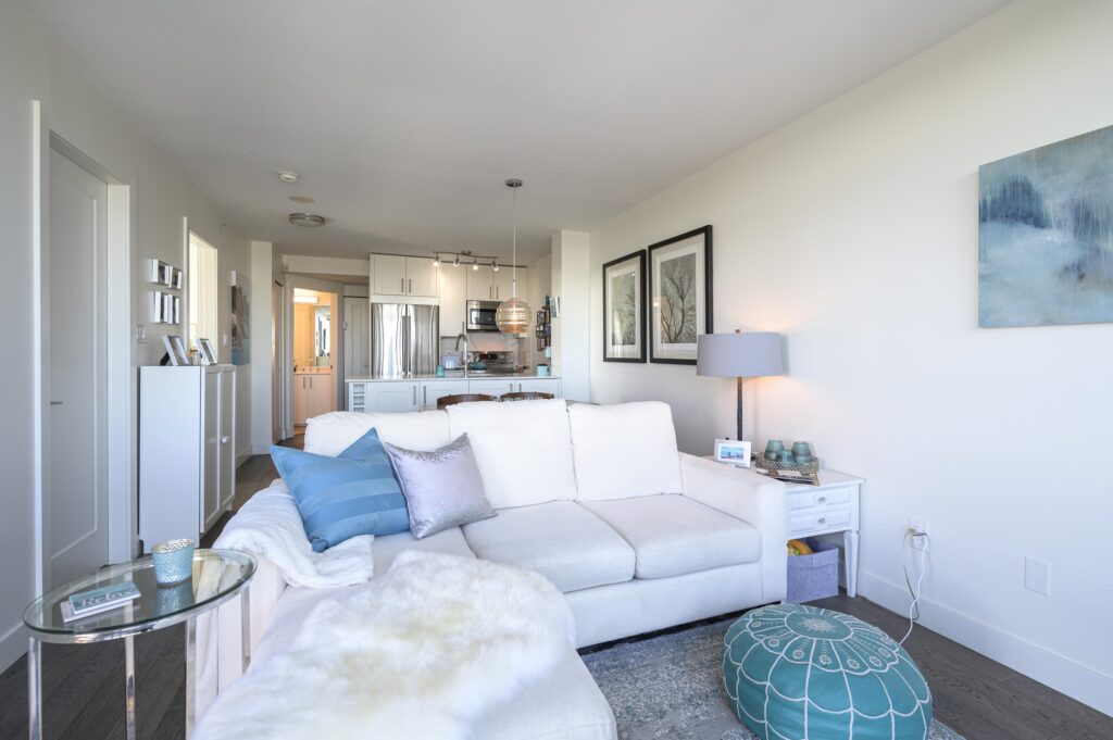
This client loved teal and sunny feeling spaces, but the teal and yellow wall combo felt busy, made the space feel small and had no continuity. Painting the space Greek Villa SW7551 from Sherwim Williams works wonders because the colour is known for it’s subtle yellow undertones that create a warm and inviting space, while still feeling bright and calm. A muted tone of teal was added in small doses with art and accessories, as everyone’s home should incorporate a favorite colour into their space.
BEFORE KITCHEN AND LIVING AREA
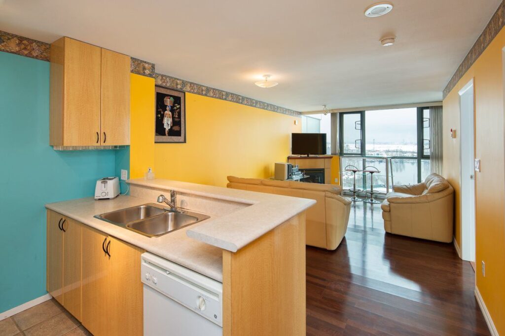
AFTER KITCHEN AND LIVING AREA
5. Choosing Trends Over Timelessness
Trends can be inspiring, but they don’t always age well. What feels fresh now may feel dated sooner than expected, especially in larger areas like walls.
We help strike the right balance, incorporating current influences in a way that still feels timeless and right for your home and lifestyle.
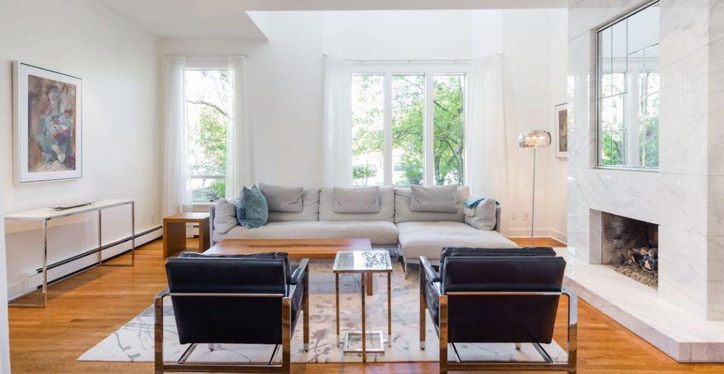
When staging and painting this home for resale. The best design choice was to pick a neutral wall colour that enhanced the tall ceilings and emphasized how how bight and airy the living space is. This was achieved with Simply White OC-117 from Benjamin Moore. This colour is timeless designer favorite, as it’s a clean, crisp white with a hint of warmth.
BONUS TIP
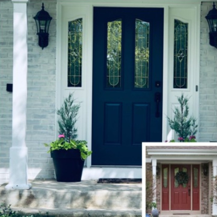
Don’t forget about curb appeal. A trained designer/colour consultant will make sure your homes’ exterior colour palate reflects the interior, so your home flows effortlessly with continuity. It’s always a good idea for the exterior to give one a sense of the accent colours used inside.
To achieve this, the front door was painted in Newburyport Blue HC-155 from Benjamim Moore to tie in beautifully with the new blue kitchen and decor accents.
How an Interior Designer Helps You Get It Right
Paint colour sets the tone for your entire home. With professional guidance, the process becomes simpler, more enjoyable, and far less stressful. You’ll avoid costly mistakes, feel confident in your choices, and end up with a home that feels beautifully pulled together.
Ready to Choose Paint Colours With Confidence?
If you’re unsure where to start—or want reassurance you’re making the right choice—we’d love to help.
Get in touch with Moorcroft Interior Design to book a colour consultation and take the guesswork out of selecting paint colours for your home.